Connected Emergency Care
Patient Safety Learning Lab
The Connected Emergency Care (CEC) Patient Safety Learning Lab formed to reduce health and financial harms caused by a fragmented and disconnected emergency care system. Our work brings together an interdisciplinary team of engineers, designers, digital architects and medical practitioners to create human-centered solutions to systemic and structural challenges.
Health and financial harms in emergency care are caused by
a combination of systems and structural factors, such as:
Absence of a longitudinal relationship between clinician and patient.
Missing clinical and social contextual information during important diagnostic, treatment, and disposition decision making.
Lack of clinical decision support that connects patient data over time to yield prognostic (predictive) recommendations to clinicians.
Inadequate outcomes-based post-encounter feedback for emergency clinicians to enable continuous practice-based learning and outcomes-driven decision-making.
Our project is supported by the Agency for Healthcare Research and Quality and our team includes members from the Johns Hopkins School of Medicine and Whiting School of Engineering, Maryland Institute College of Art and the digital healthcare solutions company StoCastic.
Our Process
We believe that effective solutions are grounded in users' wants and are adaptable to their needs.
PROBLEM ANALYSIS | DESIGN | DEVELOPMENT | IMPLEMENTATION | EVALUATION
Both the research and design processes are highly iterative. As our team looks to scope a problem, we start with problem analysis, which synthesizes the work that has been done. We also look at the current context in which we hope to build through a variety of traditional and design research methods. Using that research, we design an intervention. Throughout the design process, we tie in our end users to give feedback and set priorities for what gets built out when. Through development and implementation of the intervention, we test for viability and usability, and both shape our ultimate evaluation and future iterations of the intervention.
Case Study
Loop
Linking Outcomes of Patients | Dashboard
Lower respiratory tract infections (LRTIs) are among the most commonly treated conditions in the ED and are a leading cause of sepsis and death worldwide. Clinical decision-making for this population is complicated by nonspecific and overlapping disease presentations and diagnosis, and treatment and disposition decisions are highly variable.
Using LRTIs as a specific scope, we wanted to take a critical look at feedback systems for post-encounter data that could support physician decision making for an LRTI diagnosis.
The result of this longitudinal project is a dashboard that is intended to be an educational tool and support learning in the practice. Before, the physician would carry the burden of following up on the patient. Now, the dashboard alerts the physician about specific outcomes for patients they cared for and democratizes the process, creating a link between care and outcome.
If you are a provider, you can access the dashboard here. Be sure to connect to the VPN (through Safe Desktop or Pulse).
Our process | Idea to Developement
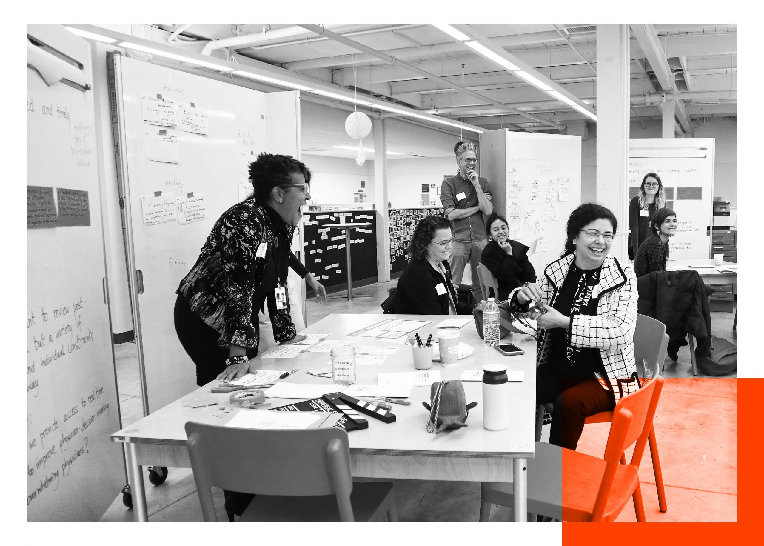

In partnership with the Center for Social Design at MICA, the team participated in a semester-long studio to scope the initial phases of design and explore the possibilities of co-designing the dashboard.
PROBLEM ANALYSIS: Methods + Data collection
1
QUALITATIVE RESEARCH | INTERVIEWS
Alongside the Whiting School of Engineering, members from Johns Hopkins School of Medicine led interviews around physician’s practice, specifically what actions they take around diagnosis, treatment and disposition look like. Themes teased out in the interviews created a picture for what care looks like for physicians and what best practices are held among physicians.
3
DESIGN RESEARCH | PROTOTYPING
After synthesizing the data collected, MICA students created personas and key insights which helped guide feedback from physicians at a group share back later in the fall.
From the insights, physicians weighed in on what experiences they would like within the dashboard — from making it look like Netflix to having an instant replay of their last shift.
5
DESIGN RESEARCH |
PROTOTYPING, PT. II
Using a blank canvas and an experience map, the MICA students took their lo-fi prototypes to the next stage by asking physicians to draw what their homepage would be using the different personas and priority areas identified.
These sketches became the base of the dashboard.
2
DESIGN RESEARCH |
INTERVIEWS + SHADOWING
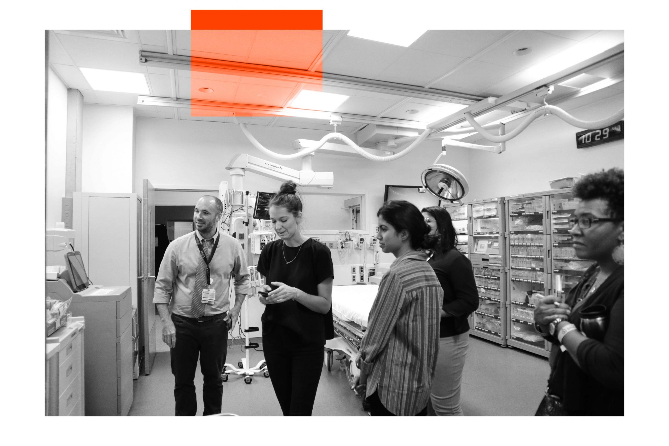
Alongside the Center for Social Design, the core team employed different design methodologies to highlight the environment of the dashboard. Students enrolled in the studio shadowed doctors at two different campuses — Howard County General Hospital and Johns Hopkins Hospital.
Students collected data about the outcomes doctors were interested in learning more about, as well as noted behaviors around digital spaces.
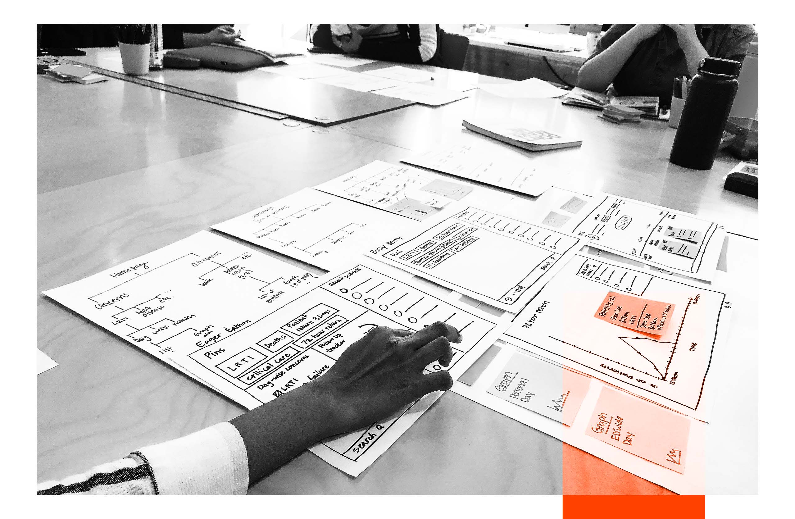
4
DESIGN RESEARCH |
PRIORITIZING IDEAS
From the information and experiences shared in synthesis and prototyping, students at MICA mapped a hierarchy of the dashboard. Through this process, the team was able to refine ideas using best practices in design and desired objectives expressed across the multiple phases of research.
Design + Development
In addition to creating physical prototypes for the team to build from, the students also helped create a series of Design Principles that helped guide the work. These principles were generated through values of the team itself coupled with the priorities of physicians.
Empower through the Work
Keep It Clear & Simple
Keep It Responsive
Value Provider’s Choices
Practice Empathy & Compassion
Put People First
After the studio finished, the team moved toward building higher fidelity prototypes alongside digital architects. The prototypes, below, helped to articulate ideas more clearly in order to assess feasibility. Physicians helped set priorities around which outcome was illustrated and what dimensions were important to each outcome. After each was illustrated, the team lead small-scale demonstrations of the dashboard to get physician feedback. This work became integral to our development and helped set expectations around what could be done and what needed to be tabled.
Click on the headings below to run through a limited function environment of the dashboard.
Version 1 articulated what the high-level homepage might look like. While it helped shape the hierarchy of the current version, this prototype was left to focus on outcomes directly instead of the macro elements.
Version 2 helped to bring outcomes into focus and create a middle tier of information. Through this process, the team focused on how to show information that helps jog a physician's memory and gives enough information to feel generative for the physician.
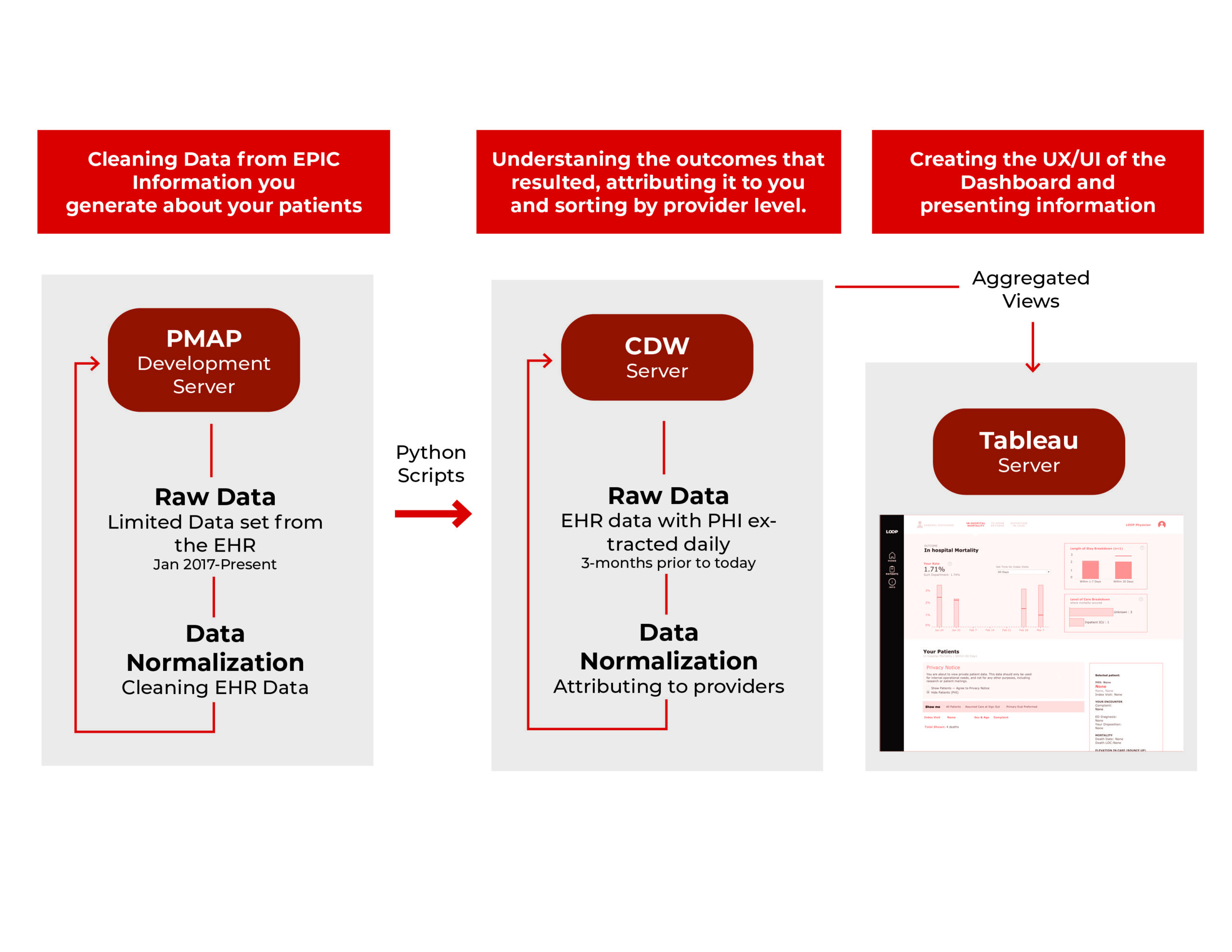
On the backend, a team of data scientists worked to take the data from the EHR and translate it into outcomes. Throughout the 5-month development, the team created a hierarchy for the data and flow to update the data daily.
